This pre-study project was created at the design agency "Bästa Kompisar". You can explore the live website by visiting it here.
Company: Aoptik, an optician and eyewear company in Sweden with 38 physical shops across the country.
My responsibilities: UX & UI Designer responsible for research, information architecture, website UI design & digital brand identity design. Project team members: Strategic project manager & digital marketer.
Final deliverables: Analytics insights report, Information architecture report, sitemap, wireframes, UI design for homepage and product page, mega-menu wireframes, graphic brand identity proposal
Project Overview
This is a case study illustrating the pre-study design process for an optician and eyewear website redesign. Starting with user and business research and information architecture analysis, moving further to problem definition, ideation, and finally prototyping/ designing alternatives.
The optical company is one of the largest players in the Swedish optical market, consisting of 38 stores all over the country. Their business concept is to offer high-quality products and services at very competitive prices.
The initial brief was to get more people to book free eye examinations, get more people into the shops, and improve the website visually. After conducting research, underlying usability problems behind the business pain were identified, which developed the initial problem statement. The final design artifacts in the study consisted of a proposal for a new information architecture, a new mega menu, a design proposal for the home page, a product page with filtering, and a graphic identity.
The process
1. Understand & Discovery
The design process started with empathizing with the business. From the stakeholder interview, we got an understanding of the business, its audiences, objectives, pain points, and value proposition to identify what needed to be achieved with the new website.
The client's main goals with the project were to:
● Get more people to book free eye examinations
● Get more people into the shops
● Improve the website visually
Competitor analysis
The competitive analysis revealed industry standards, how the company differed/should further differ from competitors, and what worked or did not work on the competitors' websites.
We mapped out the company's market strengths based on all of the research we conducted on the company. Among them were:
● The only optician offering free eye examinations
● Competent and educated staff
● A diverse selection of quality high-end brands
● A focus on progressive glass
Competitors websites mapped out for use in the competitive analysis (supported by a doc)
Company's existing website
The company's existing website
Google Analytics
As we continued our research to better understand the users and the product, we decided to look into the reasons for the low number of booked eye examinations and the poor performance of the website.
By digging into the Google Analytics data, we could get an overview of the user behavior on the website and information about the audiences. We went into this research with predefined questions, some of which were:
By digging into the Google Analytics data, we could get an overview of the user behavior on the website and information about the audiences. We went into this research with predefined questions, some of which were:
● How do the behavior flows look like? For example, how is the user behavior on pages related to eye examination? Where do users go from the homepage?
● What pages do users visit the most and least, and how much time do they spend there? Where are these pages located in the website structure, and does this make sense?
● What is the audience demographic, and what devices do they use?
● How did users enter the website, and where do they leave it? How are the bounce and exit rates? How is the conversion rate?
Interviews
A few interviews were further conducted with the audience, to primarily understand the reasons behind their choice to book an eye examination. The interviews primarily focused on the following questions:
● What makes you choose a specific optician/eyewear shop for booking an eye examination?
● What makes you choose a specific eyewear shop/optician for buying glasses?
● What makes you choose a specific eyewear shop/optician for buying glasses?
Information architecture analysis
In the discovery phase, I also dove deep into the existing products' information architecture and analyzed it based on our knowledge about the business, user behavior, and market. Was the product supporting the business goals and user needs, the users' mental models, and following best practices?
2. Define
After analyzing the data, we defined the insights and problems. The discovery phase revealed issues behind the initially defined business pains, which made us (re)define the problem statement before starting to design a solution. We listed the defined insights from the different research activities that were conducted.
User interviews
The main insights from interviews were that users seemed to book eye examinations based on where they planned on buying their new glasses. Thus, before booking an appointment with an optician, they wanted to understand (and like) the selection. They wanted to feel that the optician was trustworthy. We had these insights in mind when continuing the research.
Competitive analysis:
We listed some core points that the successful competitors offered that we believed could benefit the new website (considering the business, resources, and costs):
● Easy and intuitive flow for booking eye examinations and appointments
● Useful, valuable, and accurate information that answers questions about various types of glasses, eye problems, selection, and eye exams.
● Giving users the opportunity to navigate through the assortment in a useful way
● Higher visual (images, branding) and technical (responsiveness, booking) standards.
Google analytics data
The Google Analytics data and analysis gave us insights into which pages needed improvement, be brought out to the surface or further down in the structure. The insights based on the user behavior on the current website created a path forward for ideas for the new information architecture. Due to privacy, specifics can not be described.
IA analysis of existing website
Some of the defined problems
● The path for booking a free eye examination is confusing, not visible enough, and hard to complete.
● Insufficient information about glass types and frames, as well as difficulty navigating. Users have to choose a specific subcategory or product from the top menu when exploring the assortment since there is no general top-level category page with an overview, which makes comparison hard.
● Important pages are not visible enough. There is no flow through the pages, and there are numerous dead ends.
● Failure to emphasize strengths and competitive advantages.
● The content is not centered around customers' common problems, questions, or interests regarding the topic.
Problem formulation
Based on the defined problems and insights, we formulated a POV to create a direction for the ideation. Even if there were multiple issues on the website to be improved in the redesigned version, this could give us a direction for what to focus on when coming up with ideas.
"Our user with eyesight problems does not feel confident in booking an eye examination on the website because the booking and offering are confusing, and she is not provided the information she needs to complete the action. Our solution should deliver an intuitive, valuable, and trustworthy experience for her process of booking an eye examination on the website."
3. Ideate
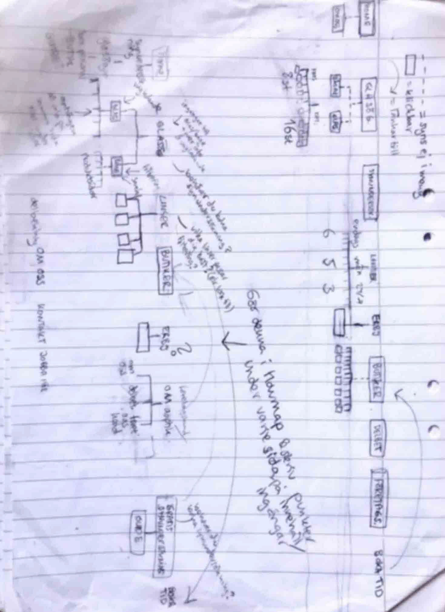
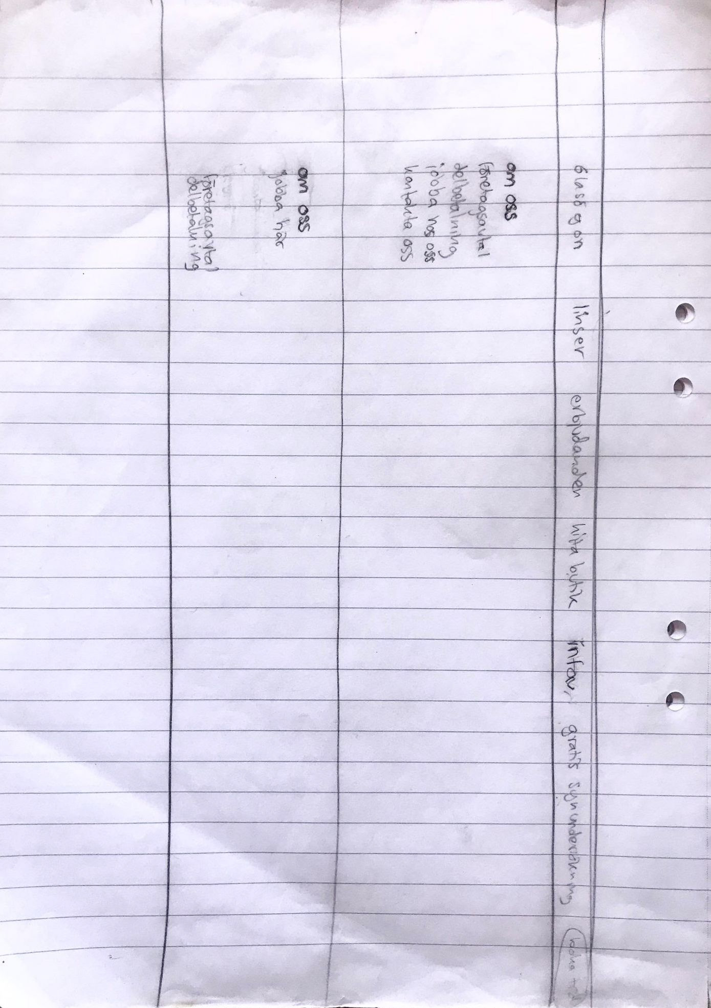
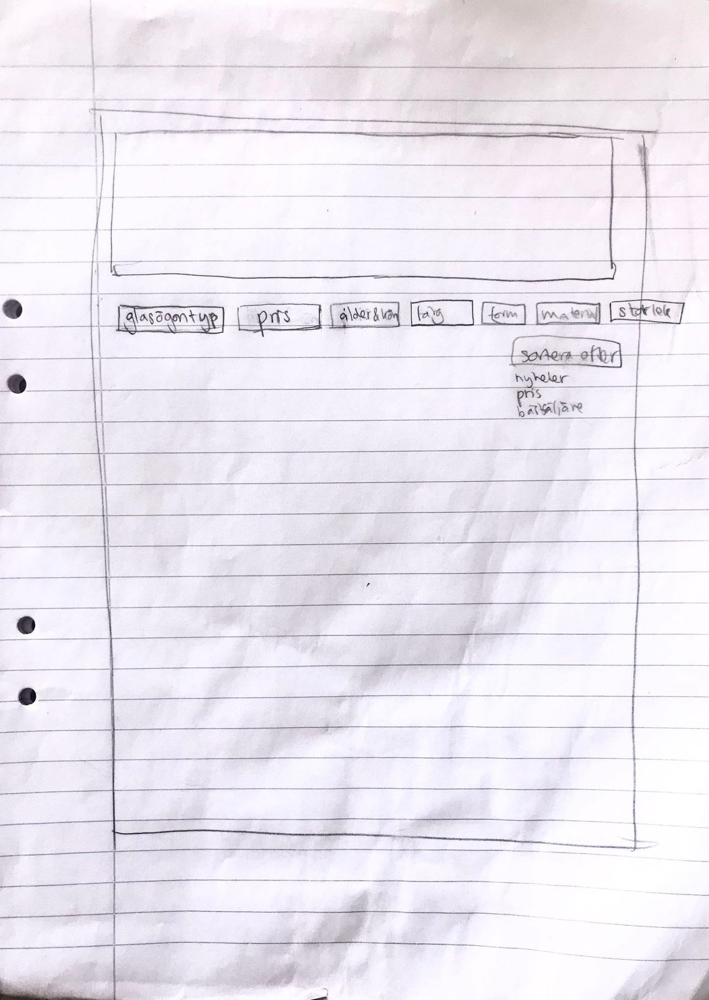
This stage was merged with the prototyping stage, since design ideas were created while prototyping and exploring design ideas. Some of the activities in this stage involved paper sketching and wireframing for the new information architecture, home page, and mega menu, inspiration gathering for the main components and branding, and design ideas for how to present the assortment in an intuitive way.


4. Design & Prototype
The prototyping was based on the following points from the ideation:
● Product page with filtering for the page "frames": to create the opportunity to explore the assortment and brands, get an overview, find a specific product, read more about the products, and book a free eye examination. This idea was based on research insights and user interests from Google Analytics.
● A new mega menu structure and information architecture, categorized based on research insights
● A new homepage structure and UI design, based on research insights
● Branding ideas: a new color palette and typeface. We chose to keep the core brand colors and introduce a secondary color scheme to be used in social media and web design elements.
The prototyping process
The following print screens illustrate some of the digital prototyping process.
Site structure visualisation with a sitemap
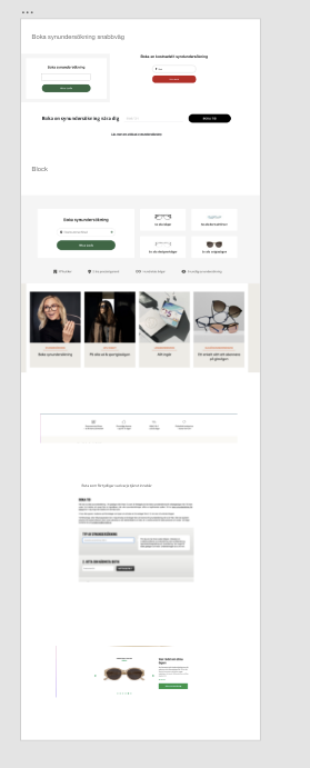
Homepage & product page structure design ideation
Exploring different design ideas and branding colors.
The final design ideas
Old website menu
New navigation structure
Product page with filtering
Home page
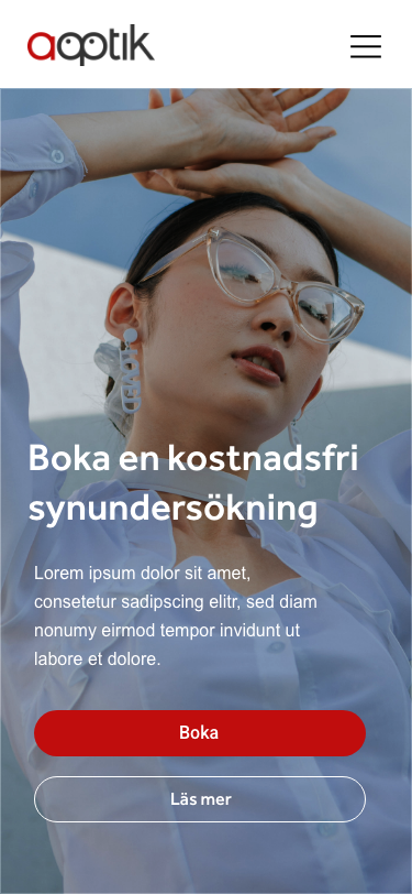
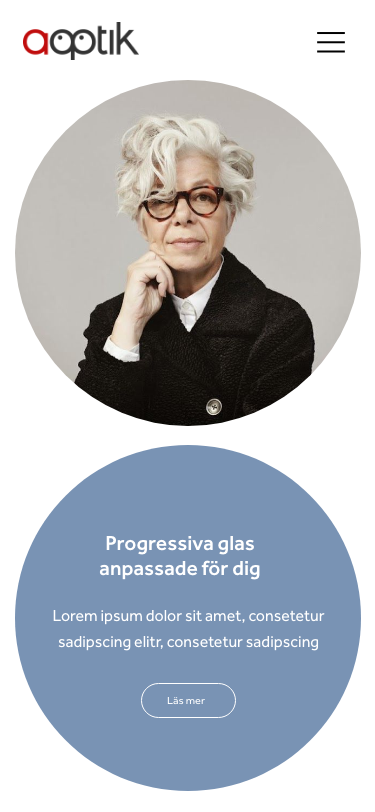
New main brand colors with 2 suggestions for secondary brand colors
Brand colors and typeface for enhanced brand identity.
SoMe ads with the new visual identity.
Intranet page for ordering of marketing material
Next steps & learnings
The design process ended here since it was a pre-study project. Optimally, there would be user testing conducted on the website structure and filtering on the product page to make sure the new design suggestions were solving the identified problems. This would be done for a few iterations. After the design was completed, Google Analytics would be used to understand whether or not the objectives were met.
There were project limitations that limited some design activities and hindered it from making the process more user-centered. User testing would have been a valuable activity to conduct early on the prototypes that were illustrating the structure before moving on to higher-fidelity prototypes. This would ideally be done for a few iterations. User testing would also have been valuable to be conducted in the early stages, on the old website design, as a complement to the analytics data.


